UI failure
Most of the user interfaces suck. That’s a bit of a paradox: I can understand how technical debt can be swept under the rug, or how customer support can be a hit-and-miss, but user interfaces? That’s your main way of interaction with users, its business value appears to be disproportional of the investment and quality.
In this article, I’m going to provide a few examples of bad interfaces and attempt to categorize the failures.
Discoverability
Everything can be discovered in a structured way, without relying on search.
This tendency has been developinig for a couple of decades, and is now stronger then ever. Look at the evolution of Windows start menu between 95 and now:
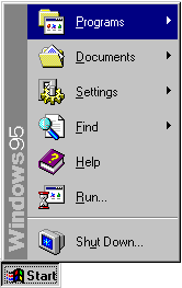
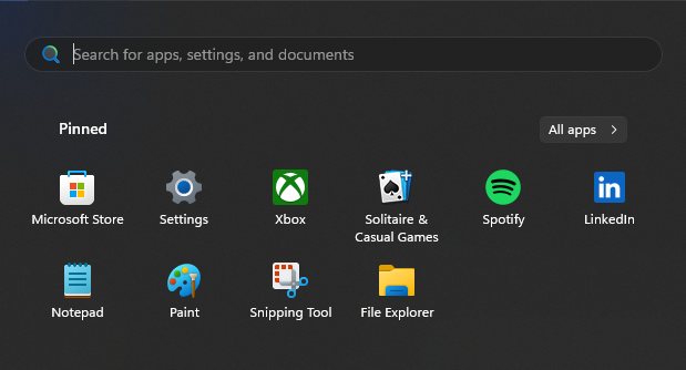
We are seeinig the change of query paradigm of the user from “show me what we have” to “please find me this”. I believe it has a deep strategic basis. The change provides more freedom to the system in the areas that have business value:
- blurs the difference between local and cloud content, which makes cloud storage more accessible
- allows filtering and re-ordering results. For example, if I’m searching for a browser, Windows may have opinions about what I can find.
- includes advertising of stuff that I don’t (yet) have
In other words, this evolution shifted control from the user to the system. We no longer own things, and instead, every day we politely ask the corporations for bits we need.
Similar things should be close together.
It took me around 30 minutes to locate this panel:

And even with that, I’m still not sure where exactly to see the full list of languages. The Windows setting interface is weird and arcane.
Another poor example is Kaiser Permanente application:

It’s a mix of different ways to get to similar functionality without a well defined structure.
At any point, there must be a way to find where you are.
A good example of this is Github API, which is generally very strong on the usability side. For navigation, there is always a row of categories at the top, with the current row selected by an underline:

Operation
Content must be loaded quickly.
User interfaces must be interactive. Any delay, even at the millisecond level, requires the user to stall while keeping attention. Any such delay must be minimized. This makes a difference between a slow IDE (like CLion) and a fast one (like Zed). The aforementioned Kaiser Permanente app is a good anti-example: its operations frequently take seconds to resolve.
I’d like to specifically point out Google mail here. It has been gradually getting worse since inception. Nowadays, it takes seconds to load, and operations have visible delays.
Navigation must be detached from content.
Why did we end up with browsers that allow content creators to hijack the “Back” button? We have an organization like W3C not being able to protect the users from this harmful behavior. We are seeing browsers implementing mitigations against this behavior, but I’m shocked to see this API existing in the first place. The navigation panel is my tool as a user. It has no place in the API for the page I’m visiting.
Similarly, sometimes when browsing Firefox on the phone, the webpage can make my controls inaccessible. Why are we allowing websites to render outside their client area?

Similar links should function similarly.
The other side of “Similar things should be close together” - if I see similarly-styled controls, I don’t expect one to do a minor change to the page while the other to transfer me to another place. KP’s application is an example here: some links just direct me to the web view of the website, where I’m not even authenticated. It’s hard to know where a link would lead me.

Content must not be changed. Especially the locations of links.
In other words, all content changes must be initiated by the user. Every time Google is injecting that awful advertisement animation in the middle of the search results - a small kitten dies somewhere. Few things are more annoying than something messing with the content at the same time as you are interacting with it. The effect is similar to the navigation issue: content should be separated from the view, and the view is to be controlled by the user.
Every user action needs to be acknowledged.
We need feedback at all times. The faster - the better. This experience is generally good when browsing the web on desktop: hovering the mouse makes some elements receive highlights, clicking makes the browser show the loading progress bar, etc. Things are much worse on mobile: hovering gives you no signal, clicking may not necessarily register. Sometimes I’m not sure if I clicked too early and the original page is still loading, or it’s my request being loaded while the original page is displayed.
Good examples
We have already mentioned GitHub. I suspect the usability aspect played a major role in becoming the de-facto platform for Open Source.
Another great example is the Fastmail website. It’s very responsive (certainly lighter than GitHub), clean, has clear navigation, up to the point where you never notice it. I hope it stays like this and doesn’t fall under pressure from “modern” UI needs.
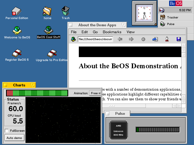
Back in the day, a good OS UI example was shown by BeOS (or its resurrection - Haiku). One of the architectural decisions was to have a dedicated thread per window for processing events. This, coupled with good kernel scheduling of threads, provided interfaces that were consistently responsive. At the time, neither Linux or Windows were as accessible.
In addition to operational usability, it also had great discoverability. See, both UNIX and Windows filesystem structures are horrific! Why would I want my apps to be in /usr/local/share or c:\Program File (x86)\? BeOS on the other hand, had a clear structure targeted at a single user. You could walk the filesystem and make sense of everything you need, without dedicated navigation apps/menus.
Conclusion
Many user-facing systems around us have gross violations of basic principles of usability. I must have some very non-standard expectations here, seeing how those issues are tolerated. I’m putting my wallet where my mouth is. I hope that we collectively exert more pressure (or provide a stronger signal) to the industry about how bad the situation with user interfaces is. I hope to see lower latencies and less clutter. I hope to see the Web user agents (like Firefox) being more strict and opinionated about providing a good user experience.